

Leveraging Material UI to write declarative code at Doma has helped us streamline our development, reducing friction and inconsistencies. This blog post shares a practical use case to help you understand the value of being declarative and, hopefully, apply these changes in your Material UI apps.
Why Declarative?
What is so special about declarative code? Why should I bother? Let’s start with a simple definition:
”Declarative programming is a method to abstract away the control flow for logic required for software to perform an action, and instead involves stating what the task or desired outcome is.”
Source TechTarget
In the context of UI development, writing declarative code means that you are abstracting away common adaptations so that application developers don’t have to code them again and again. To illustrate this better, here is an example of a header section that is close to a real use case at Doma.
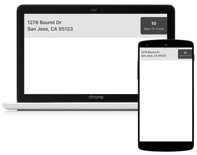
Our apps are responsive and any design specification will include the desktop and mobile layouts. This means that the Header component will adapt to changes in screen size. See if you can spot all the differences in these layouts.
5 minutes later…
Did you find them all? Here is what is changing:
- Address font size changes from 24px to 20px
- Header padding changes from 24px to 16px
- Border radius changes from 12px to 6px
- “Days to close” font size changes from 20px to 16px
Here is the code for the Header component using React and MUI. You can view and edit this Imperative header example in CodeSandbox.
| export const Header = () => { const theme = useTheme(); const useMobile = useMediaQuery(theme.breakpoints.down(“sm”)); return ( <Box sx={{ display: “flex”, alignItems: “center”, justifyContent: “space-between”, backgroundColor: “#e3e3e3”, color: “#444444”, paddingLeft: useMobile ? 2 : 3, paddingTop: useMobile ? 2 : 3, paddingBottom: useMobile ? 2 : 3 }} > <div> <Typography variant={useMobile ? “h6” : “h5”}> 1276 Bouret Dr </Typography> <Typography variant={useMobile ? “h6” : “h5”}> San Jose, CA 95123 </Typography> </div> <Box sx={{ borderTopLeftRadius: useMobile ? “6px” : “12px”, borderBottomLeftRadius: useMobile ? “6px” : “12px”, backgroundColor: “#444444”, padding: useMobile ? 2 : 3, display: “flex”, flexDirection: “column”, alignItems: “center”, justifyContent: “center” }} > <Typography variant={useMobile ? “body1” : “h6″} color=”white”> <b>10</b> </Typography> <Typography variant=”caption” color=”#CCCCCC” textAlign=”center”> days to close </Typography> </Box> </Box> ); }; |
This was the way we developed apps a year ago. Notice the amount of isMobile checks.
We decided to fix this! Let’s start by understanding the pain points:
- Developers spend way too much time in Figma fine-tuning and inspecting the design specifications
- Design specifications have little to no abstraction
- Embedding background and foreground colors inside the React components is difficult for theming
- Developers replicate UI code because we are not creating abstractions for common adaptations. This makes future refactoring harder
All that to say that we were not a very declarative organization. The next step was to list the common adaptations to strive for declarative solutions:
- Heading (Typography) font size changes
- Spacing size changes
- Radius
- Margin
- Padding
- Sizing changes
- Width
- Height
- Color changes
- Dark
- Light
- High Contrast
Declarative Typography
The support for declarative Typography is built-in in MUI. It is called responsive font size.
You can create your common typography variants as follows. You can view and edit this Declarative Typography example in CodeSandbox.
| const theme = createTheme(); theme.typography = { title: { fontSize: “40px”, [theme.breakpoints.down(“sm”)]: { fontSize: “18px” } } }; export default function App() { return ( <ThemeProvider theme={theme}> <Typography variant=”title”>Resize me</Typography> </ThemeProvider> ); } |
Notice the theme configuration that adjusts the font size for the sm breakpoint.
Declarative Spacing & Sizing
For spacing and sizing the declarative support starts by using inline breakpoints in MUI system prop elements.
| <Box padding={{ xs: ’12px’, md: ’18px’ }} /> |
The result of this code is using 12px padding from extra small to medium, and 18px otherwise. Compare that with:
| const useMobile = useMediaQuery(theme.breakpoints.down(“sm”)); <Box padding={useMobile ? ’12px’ : ’18px’} /> |
Now we expand the common sizes and spacing values in a separate module. You can view and edit this Declarative Spacing & Sizing example in CodeSandbox.
| import { xlargeSizing } from “./sizing”; import { smallSpacing } from “./spacing”; export default function App() { return ( <Box border={1} width={xlargeSizing} padding={smallSpacing}> Im a declarative Box </Box> ); } |
For example, here is what the sizing module could look like:
| export const xsmallSizing = { xs: “24px”, md: “48px” }; export const smallSizing = { xs: “48px”, md: “64px” }; export const mediumSizing = { xs: “64px”, md: “72px” }; export const largeSizing = { xs: “72px”, md: “96px” }; export const xlargeSizing = { xs: “96px”, md: “120px” }; export const hugeSizing = { xs: “120px”, md: “140px” }; |
It is important to mention that there is an active issue being explored in MUI that would allow developers to use declarative values like:
| <Box padding=”medium” /> |
The definition for medium would live inside the MUI theme.
Declarative Colors
Material UI has a defined data structure for its color palette and it is important to understand it before making it declarative.
| const theme = createTheme({ palette: { aColor: { main: ‘white’ light: ”, dark: ” contrastText: ” }, text: { primary: ‘black’, secondary: ‘black’ }, } }) |
Color is an object with main, light, dark, and contrastText. Initially, we thought that dark and light were the versions of those colors when using a different theme mode (light and dark). But light and dark are optional color values that would represent a different shade of that color (not at all associated with theme modes). For example, a primary contained Button uses primary.main as the background color, and primary.light on hover. It also uses primary.contrastText as the foreground color for the text inside a button. For the text color, the data structure is different. You don’t get light, dark, and main, but rather you can define the different text shades like primary and secondary.
Here is what a declarative color component looks like with Material UI. You can view and edit this Declarative Colors example in CodeSandbox.
| const lightTheme = createTheme({ palette: { daysToClose: { contrastText: “white”, main: “#444444” }, appBackground: { main: “#e3e3e3”, contrastText: “#444444” } } }); const darkTheme = createTheme({ palette: { mode: ‘dark’, daysToClose: { contrastText: “white”, main: “#444444” }, appBackground: { main: “black”, contrastText: “white” }, text: { secondary: “#e3e3e3” } } }); export default function App() { const body = ( <Box display=”flex” backgroundColor=”appBackground.main” color=”appBackground.contrastText” padding=”12px” justifyContent=”space-between” > <Typography>123 Test</Typography> <Box backgroundColor=”daysToClose.main” color=”daysToClose.contrastText”> <ThemeProvider theme={darkTheme}> <Typography>10</Typography> <Typography color=”text.secondary” variant=”body2″> days to close </Typography> </ThemeProvider> </Box> </Box> ); return ( <Box display=”flex” gap=”24px” flexDirection=”column”> <ThemeProvider theme={lightTheme}>{body}</ThemeProvider> <ThemeProvider theme={darkTheme}>{body}</ThemeProvider> </Box> ); } |
A lot is going on, let’s unpack this
First, we create semantically named colors (daysToClose and appBackground) and we define the values for these colors, including all the different theme modes (light and dark). Then, we consume these colors using the Box component:
<Box backgroundColor=”appBackground.main” color=”appBackground.contrastText” />
It is important to define the foreground color for each background color, so that the combination is always accessible.
The most important thing to note is, as we change the theme from light to dark, we don’t have to change the body, our markup is declarative! We are creating markup that scales to the different theme variations. For example, enabling high-contrast theme is easily achievable by just creating a new theme instance and passing it down to the app.
| <ThemeProvider theme={highContrastTheme}> // nothing changes here… </ThemeProvider> |
Can you imagine how hard it would be to support this if we are coding like the imperative example from a year ago?
Here is the CodeSandbox that changes the imperative example and makes it declarative using all the things we learned in this article.
Conclusion
Material UI is an amazing framework and consuming it using declarative APIs is a great way to create markup that scales. At Doma, we are taking that to heart in all areas of development.
We are looking forward to helping MUI evolve and make the developer experience even better than it is today.
Are you developing using a declarative approach? What do you like about it? Let us know!